We can't find the internet
Attempting to reconnect
Something went wrong!
Hang in there while we get back on track
Ancestor Charts
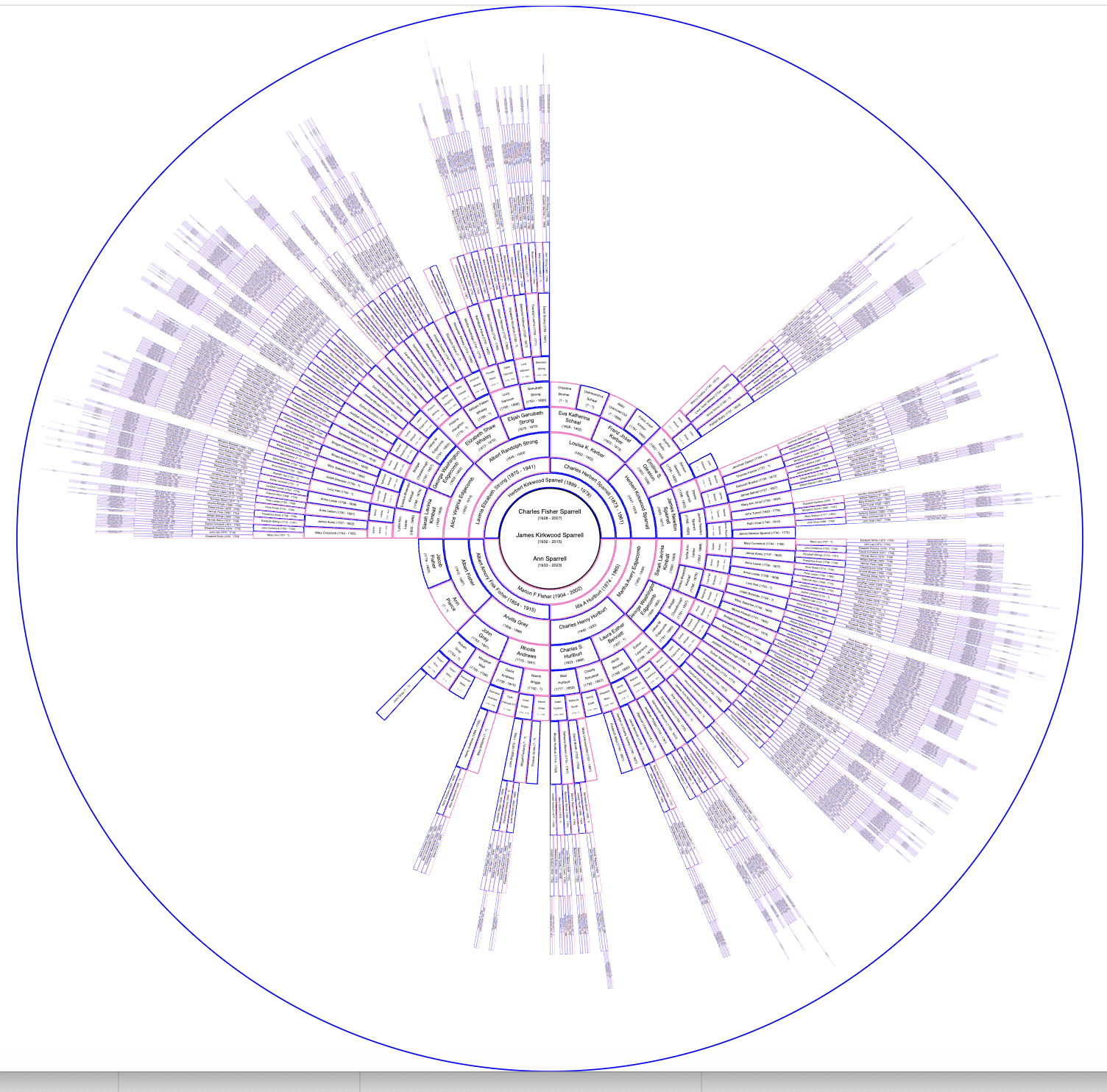
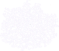
Here is the 'main' circle chart: Click here for the basic "Ship Circle Chart": explain colors, dups, etc. * remove cruft below here after moving it to appendix chapter in book1. Custom Circle Charts
1.1 Original Circle Chart
Click here for the basic "Ship Circle Chart":This chart is a "circle chart". It was created with custom software since others only went to 11 generations. This goes to 14. However it becomes obvious why the others only went to 11. The amount of space on the circumference halves with each generation. Browsers don't have the capbility to zoom in quite enough, but other tools such as inkscape do. When printed on a five foot by five foot piece of paper (the largest I could find), the printing on the outer two generations is still too small to see. Even with a magnifying glass, the ink runs together that small. Although a good chart, it is only good with proper viewing tools.
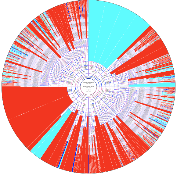
1.2 Ship Circle Chart
Click here for "Ship Circle Chart":Ditto previous section comments. This is the same chart but annoted. Immigrant ancestors whose ship is known are shown with dark blue 'sectors' filling out the circle. Ideally the entire circumference would be dark blue.
Immigrant ancestors whose ship is not known are shown with aqua blue sectors. Research still needs to be done to find their ships.
The red indicates 'line terminations' prior to reaching the immigrant. Research still needs to be done to find their ancestors back to immigration.
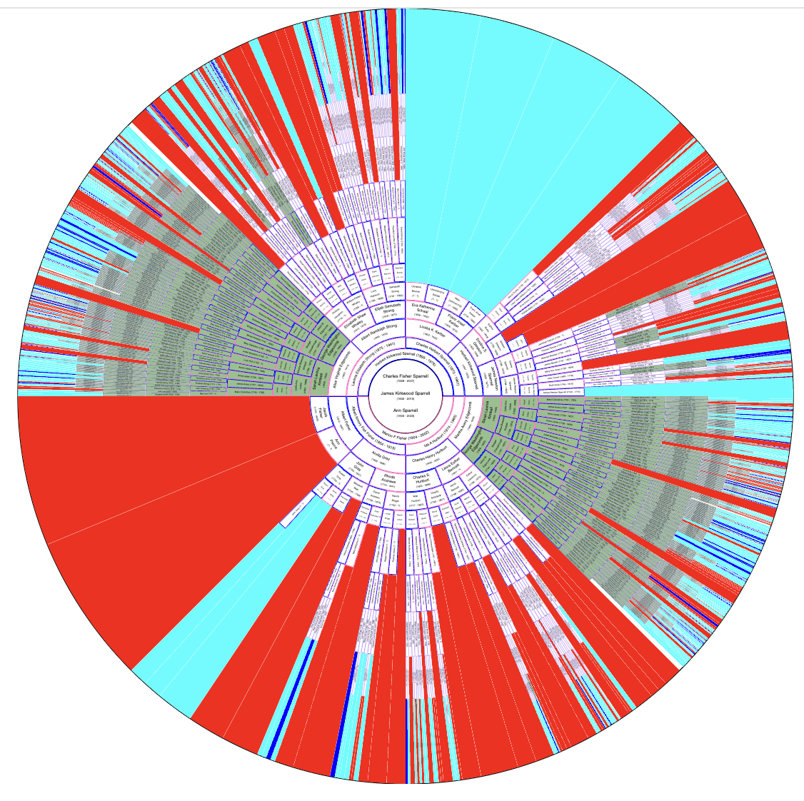
1.3 Duplicates Circle Chart
Click here for "Ship Circle Chart":Duplicates are colored green -ie where a person appears more than once in the chart due to intermarriage between ancestral lines.

